




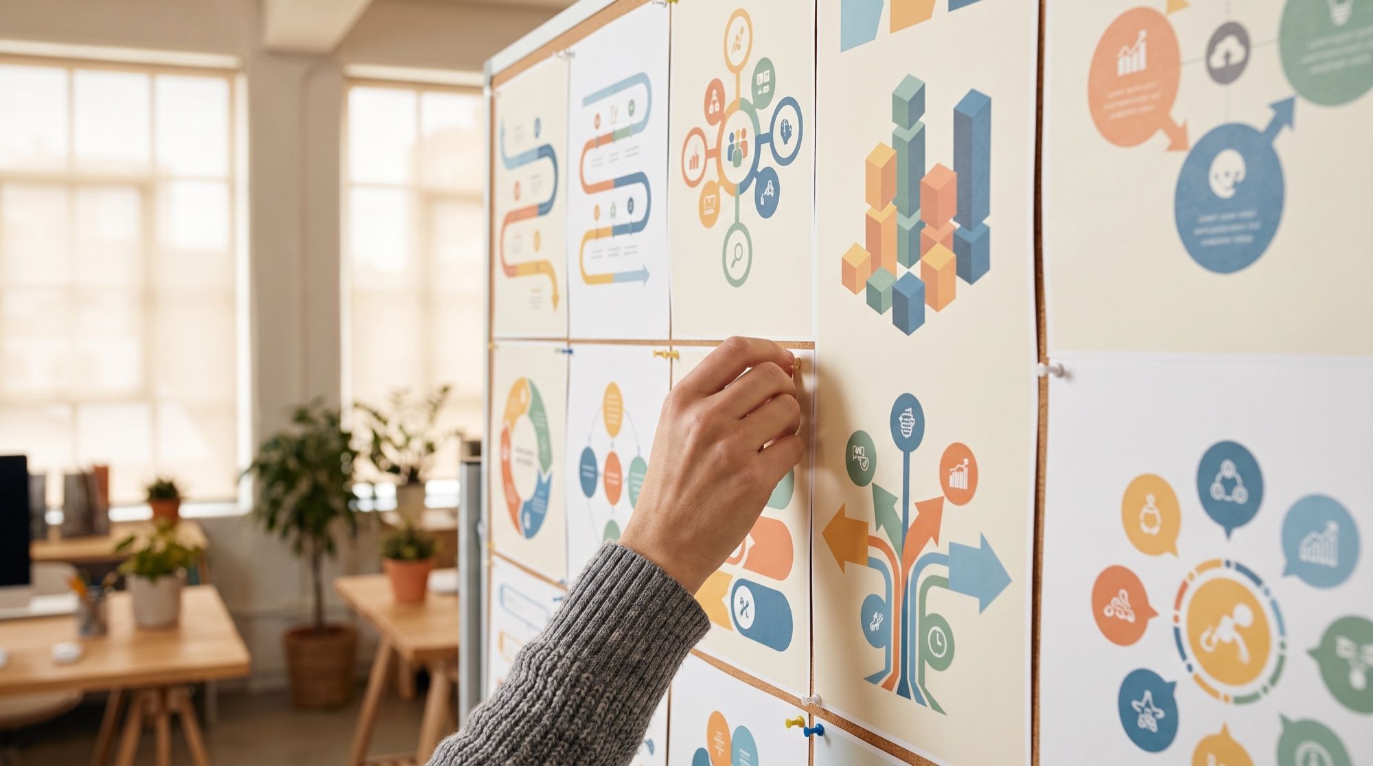
An infographic is an image where text and graphics explain one idea: the steps of a process, a comparison of two options, a timeline or a set of numbers. Just a couple of years ago, image generators turned labels into strings of random letters, especially in non-Latin scripts. We checked how 2026 models handle it: we made four types of infographics with Russian labels and counted the errors.
1. Which AI makes infographics with accurate text
We sent the same diagram, «Как запустить интернет-магазин за 5 шагов» (“How to launch an online store in 5 steps”), to GPT Image 2.5 and Nano Banana Pro.
| GPT Image 2.5 | Nano Banana Pro | |
|---|---|---|
| Russian text | no errors | no errors |
| Extras | none | quotes in the headline, the word “Buy” on an icon |
| Layout | strict column, large bold font | steps on both sides of a line, thinner font |
| Icons | match each step | match each step, more detailed |
In our tests, GPT Image 2.5 is the best choice for text-heavy infographics: it follows lettering instructions most precisely. Nano Banana Pro works when there’s little text and the illustration matters more. Nano Banana 2 and Seedream handle Cyrillic too, but in our product listing test Nano Banana 2 also copied the quotes from the prompt, and Seedream’s thinner font is harder to read at small sizes.
2. Four types of infographics AI does well
Steps and processes
Numbered steps are the most reliable format: short labels, a clear structure. The prompt for the diagram above:
Clean vertical infographic in a flat modern style on a light cream
background. At the top the headline «Как запустить интернет-магазин
за 5 шагов». Five numbered steps from top to bottom, connected by a thin
dotted line, each with a number in a circle, a simple flat icon
and a short label: 1 «Выберите нишу», 2 «Найдите поставщика»,
3 «Сделайте карточки товаров», 4 «Запустите рекламу», 5 «Собирайте
отзывы». Palette: deep teal, coral and cream. All Russian text exactly
as written, no other text, no logos
Comparing two options
Two columns and 3–4 rows of criteria. The model picks icons for the column headers on its own.
Clean comparison infographic in a flat style, two columns side by side
on a warm light background. At the top the headline «Эспрессо или
фильтр-кофе». On the left a column with an espresso cup icon and the
header «Эспрессо», on the right one with a pour-over dripper icon and the
header «Фильтр». Three rows with labels on the left: «Время»:
«25–30 секунд» and «3–4 минуты»; «Помол»: «Мелкий» and «Средний»;
«Вкус»: «Плотный» and «Лёгкий». Palette: coffee brown, warm beige,
soft orange accents. All Russian text exactly as written, no other
text, no logos
Timeline
A horizontal line with 4–6 points. The model wraps long labels onto two lines by itself, but it’s better to keep them to 3–4 words.
Clean horizontal timeline infographic in a flat style on a light
background. At the top the headline «Год блога: пример плана».
A horizontal line with five points, a small icon above each and a label
below each: «Январь — первая статья», «Март — 1 000 читателей»,
«Июнь — запуск рассылки», «Сентябрь — 10 000 читателей», «Декабрь —
первый партнёр». Palette: navy blue, mint and white. All Russian text
exactly as written, no other text, no logos
Chart with data
A bar or pie chart with labels and percentages. This is where AI has a weak spot — more on it in the next section.
Clean infographic with a horizontal bar chart in a flat style on a white
background. At the top the headline «Откуда приходят покупатели».
Four horizontal bars, length strictly proportional to the values,
a label on the left and the value at the end: «Поиск» 42%,
«Соцсети» 27%, «Реклама» 19%, «Рассылка» 12%. At the bottom a small
caption «Данные условные». Palette: purple and light gray. All Russian
text and numbers exactly as written, no other text, no logos
Another common type is the product infographic: benefits, how it works, what’s in the box. It has its own guide on AI infographics for marketplace listings.
3. How to write an AI infographic prompt
All the prompts above follow the same five-part structure:
| Part | What to specify | Example |
|---|---|---|
| Type and format | steps, comparison, timeline, chart; vertical or horizontal | “vertical infographic”, “16:9” |
| Headline | the exact text in quotes | “A year of blogging: a sample plan” |
| Items | how many, and every label in quotes | “five steps: 1 ‘…’, 2 ‘…’” |
| Style and palette | flat, line art, 3D; 2–3 colors | “flat style, navy blue and mint” |
| Constraints | ban anything extra | “all text exactly as written, no other text” |
OpenAI gives the same advice in its GPT Image prompting guide: put the required text in quotes, specify its placement and styling, and ask the model not to add anything else. Google’s documentation for Nano Banana recommends the same for on-image text: exact wording, a description of the font and the overall design. More tricks for text and edits are in our Nano Banana Pro prompts guide.
4. Where AI infographic generators get it wrong
- Chart proportions. We measured the bars on our chart. Taking the “42%” bar as the reference, “27%” came out 5% longer than it should be, “19%” 12% longer, and “12%” 21% longer. The numbers are labeled correctly, but the eye reads length. For reports with real data, that’s a deal-breaker.
- Quotes and stray words. Nano Banana Pro and Nano Banana 2 sometimes copy quotation marks from the prompt onto the image. If that’s a problem, write “headline without quotation marks”.
- Extra words. English labels like “Buy” may appear on icons. The line “no other text” helps, and so does checking every icon.
- Long text. Paragraphs and small fonts raise the risk of typos. Keep labels to 3–5 words and items to 5–6.
- Facts. The model draws what you wrote and doesn’t check the content. Verify numbers and claims yourself.
5. AI or a chart tool: which to use
| Task | What to use |
|---|---|
| A steps diagram, comparison or timeline for a post or article | AI — fast and in any style |
| An illustrated infographic with characters and objects | AI — a chart tool can’t draw that |
| A report with exact data, charts and shares | a spreadsheet or charting tool — proportions are guaranteed |
| A presentation with dozens of slides in one style | a presentation editor, with AI for the slide illustrations |
A workflow that works for reports: build the chart from data in a chart tool, and use AI for the icons, background and illustrations around it.
6. Free AI infographic generator online
Quality models don’t run fully free: generation costs money on the developer’s side. AI2Face gives you starter credits when you sign up — enough to test a few infographics. The cost of each generation is shown before you run it, and credits from packs don’t expire. Everything works online in the browser, nothing to install.
Bottom line
For infographics with text in 2026, use GPT Image 2.5: in our test four types — steps, a comparison, a timeline and a chart — came out without a single error in the labels, even in Cyrillic. Nano Banana Pro is good when the infographic is more picture than text, but check it for stray quotes and English words. AI handles diagrams and illustrations very well, while for accurate charts from real data a spreadsheet is still more reliable. In AI2Face, GPT Image 2.5 and Nano Banana Pro are in one generator, with the cost shown before every run.
FAQ
Which AI can make infographics with accurate text?
GPT Image 2.5: in our test all four infographics came out with error-free text, even in Russian. Nano Banana Pro also handles Cyrillic, but it added quotation marks to the headline and an English word on an icon.
Can I make infographics with AI for free?
Partly. AI2Face gives you starter credits when you sign up — enough for a few infographics. The cost of each generation is shown before you run it.
Can AI draw an accurate chart from data?
Not always. In our test the labels and percentages were correct, but the short bars came out too long: 12% was drawn roughly as 15%. For reports with exact data, build the chart in a spreadsheet and use AI for the design around it.
How do I write a prompt for an infographic?
Name the type (steps, comparison, timeline, chart), the number of items, the exact labels in quotes, the palette and the style. End with “all text exactly as written, no other text”.
Can AI turn text into an infographic?
Yes, but first cut the text down to 3–6 short points — the model draws labels, it doesn't lay out paragraphs. Any text AI can do the shortening, and GPT Image 2.5 can make the image.
Sources
2
- https://developers.openai.com/api/docs/guides/image-prompting
- https://ai.google.dev/gemini-api/docs/image-generation