








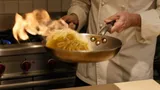
Infographics are the listing slides that show the product together with text: benefits, construction, what’s in the box, compatibility. Designers used to build them from templates in an editor; now one slide is one prompt plus a product photo. We tested this on a frying pan: a kitchen snapshot became four working slides and one deliberately bad one to show what not to do. All slides were made in GPT Image 2.5, the model that handled text and layout best in our tests.
1. Which AI to use for marketplace infographics
Infographics need two things: accurate text and an unchanged product. The model should get both right on the first try, or every slide turns into a string of reruns.
| Model | Text on the slide | Layout | When to use |
|---|---|---|---|
| GPT Image 2.5 | error-free on clean slides in our tests | strict grid, large font, relevant icons | your main tool for infographics |
| Nano Banana Pro | handles Cyrillic, good for headlines | looser, closer to a photo | slides with the product in a scene and little text |
| Nano Banana 2 | handles Cyrillic, but may copy quotes from the prompt | simpler | quick drafts |
A side-by-side test of three models on one infographic prompt is in our overview of AI for ecommerce sellers.
2. Five types of infographic slides
Benefits slide
The first slide after the main image. Product name, 3 benefits with icons, large font. Our test labels are in Russian; for your listing, write them in your buyers’ language.
Turn this photo into the first infographic slide for a marketplace
listing. Keep the frying pan exactly as in the photo: dark graphite
non-stick coating, light beech handle, steel rivets. The pan seen from
above at a slight angle on a warm light gray background with a soft
shadow. At the top a large headline «Сковорода 28 см». Below the pan,
in a row, three short benefits with thin line icons: «Не пригорает»,
«Для индукции», «Ручка из бука». Large readable font, dark graphite
text and one terracotta accent, all Russian text exactly as written,
each label appears once, no other text, no logos. Vertical 3:4
“How it’s made”, what’s in the box and compatibility
The next slides answer questions the buyer would otherwise ask in reviews.
- Construction or ingredients — a cross-section, layers, materials. For cosmetics it’s the ingredients; for clothing, the fabric and lining.
- What’s in the box — everything in the package, laid out flat. It answers “does it come with a lid?”.
- Compatibility — what it works with: stove types, phone models, bed sizes.
Make an infographic slide showing how the frying pan is built. Keep its
appearance as in the photo. Show a clean cross-section diagram of the
base with four layers, each with a thin callout and a short label:
«Алюминиевый корпус 4 мм», «Грунтовочный слой», «2 слоя антипригарного
покрытия», «Индукционный диск». At the top the headline «Как устроена».
Warm light gray background, dark graphite text, terracotta lines,
all Russian text exactly as written, no other text, no logos.
Vertical 3:4
Make a “what's in the box” slide: a flat lay from above on a warm light
gray background — this frying pan, a round glass lid with a beech knob
and a beech spatula. Terracotta callouts with labels: «Сковорода»,
«Стеклянная крышка», «Лопатка из бука». At the top the headline
«В комплекте». All Russian text exactly as written, no other text,
no logos. Vertical 3:4
Make a slide about stove compatibility. This frying pan from above,
centered on a warm light gray background. Below it a 2×2 grid of simple
line icons with labels: «Газ», «Электро», «Индукция», «Стеклокерамика».
At the top the headline «Подходит для всех плит». Terracotta icons,
large readable font, all Russian text exactly as written, no other
text, no logos. Vertical 3:4
A fifth common type is the dimensions slide: dimension lines and numbers. Its prompt and an example are in our AI product photography prompts.
How many slides to make
Usually 3–5 infographic slides after a clean main image are enough. One slide, one idea: if dimensions and box contents creep onto the benefits slide, the buyer won’t read any of it.
3. Text rules for product infographics
- 3–4 points per slide, 2–4 words each. Listings are viewed as thumbnails on a phone, where a paragraph is unreadable.
- Large font, no outlines or shadows. Ask for a “large readable font” — effects on small text turn letters into mush.
- One background and one accent color for the whole series. Ours were warm light gray and terracotta, so the slides look like one listing.
- Every label in quotes and “appears once”. That’s what OpenAI recommends in its GPT Image prompting guide: exact text in quotes, its placement, and a ban on extra text.
- Only verifiable facts. “4 mm body”, not “the toughest”. Take numbers from the manufacturer’s specs — the AI will write anything.
4. Marketplace infographic requirements: Ozon and Yandex Market
Every platform has its own rules. As an example, here’s what two of Russia’s largest marketplaces specify in their official help pages:
| Ozon | Yandex Market | |
|---|---|---|
| Aspect ratio | vertical 3:4 in all categories | photos are fitted to 3×4 in the storefront |
| Resolution | clothing, shoes, accessories — from 900 × 1200 px | from 300 × 300 px |
| File | up to 10 MB, JPEG, PNG, HEIC, WEBP | up to 10 MB, JPG, PNG, HEIC, WEBP |
Yandex Market spells out what images must not contain: price tags, discounts, store or marketplace logos, watermarks, contact details, links, delivery information. The text can’t say “best”, “perfect”, “original” or make comparisons like “alternative to”. For infographics that’s a direct rule: “Bestseller”, “The best frying pan” and “30% off” on a slide may fail moderation.
Wildberries publishes its requirements in the seller dashboard help, and Amazon, Etsy and other platforms do the same — check the format and text rules there. On any platform, set the format explicitly in the prompt: “vertical 3:4”.
5. Mistakes: what a bad infographic looks like
Same product, same set of facts — but done the way it often is in a rush: a loud gradient, ten badges, five fonts, “Bestseller” and “A gift for Mom”.
What’s wrong here:
- The product takes up a fifth of the frame — the buyer can’t see what’s for sale.
- Ten claims instead of three — none of them sticks.
- Empty words — “Quality”, “Warranty”, “Bestseller” say nothing, and Yandex Market bans “bestseller” and evaluative claims.
- A typo in the word for “glass” — on small, cramped text even the best text model slips. The fewer and larger the labels, the more reliable the result.
Compare it with the first slide above: the same benefits, but three labels and a product filling half the frame.
6. AI or a template builder
Online infographic builders offer ready-made templates: drop in a photo, type the text. That’s handy if you have a hundred similar products and speed matters.
AI is better when you need to:
- show what isn’t in the photo — a cross-section, layers, the product in use;
- skip the cutout work — the model removes the background and sets the lighting itself;
- keep your own style instead of a template thousands of sellers use.
A common workflow is to generate the slide with AI and, if there’s a lot of small text and numbers, touch them up in an editor.
Bottom line
AI makes marketplace infographics faster than a designer when each slide carries one idea and three or four short labels. Use GPT Image 2.5 for any slide with text and Nano Banana Pro for scenes with the product and a person. Five slide types cover almost any listing: benefits, construction or ingredients, what’s in the box, compatibility, dimensions. Before uploading, check every label and number and remove claims like “best” — neither buyers nor marketplace moderators like them. In AI2Face, GPT Image 2.5 and Nano Banana are in one generator, the cost is shown before each run, and the starter credits cover your first slides.
FAQ
What should a product infographic say?
One idea per slide: 3–4 benefits of 2–4 words each, how it's made or what it contains, what's in the box, compatibility, dimensions. Only facts the buyer can verify — no “best” or “bestseller”.
How many infographic slides does a listing need?
Usually 3–5 after the main image: benefits, construction or ingredients, what's in the box, dimensions, a use case. Keep the main image clean — the product on a light background.
Which AI makes product infographics with the most accurate text?
GPT Image 2.5: in our tests its labels on clean slides came out error-free, even in Russian. Nano Banana Pro and Nano Banana 2 handle Cyrillic too, but they hold a strict layout less often.
Can I make product infographics with AI for free?
Partly. AI2Face gives you starter credits when you sign up — enough for a few slides. The cost of each generation is shown before you run it.
What are marketplace rules for text on product images?
Ozon requires a vertical 3:4 format; Yandex Market bans prices, discounts, store logos and words like “best” and “original” on photos. Amazon, Etsy and other platforms publish their own rules in seller help — check them before generating a series.
Sources
3
- https://developers.openai.com/api/docs/guides/image-prompting
- https://docs.ozon.ru/global/products/requirements/media/image-requirements/
- https://yandex.ru/support/marketplace/ru/assortment/create/main-fields/images